网页设计
色带和标签在网页设计中的使用
你可能已经浏览过数百个网站,看过几十种设计风格的网站。如果你是个设计师,网页设计师或者交互设计,前台设计师,你有注意到那些设计趋势吗?有没有发现色带和标签的使用开始频繁起来。那么为什么大家都开始使用色带和标签呢?首先它可以让有的标题变得醒目起来,加上对比或者3D的效果,让整体富有视觉冲击性,然后其良好的可变动和灵活性加大了色带和标签的使用范围。你可以方便的将其融入到网页整体的任何位置。下面是我们展示给大家的一些优秀的色带和标签使用的网站,你可以从中获得灵感。
Ribbons
Letter Learner
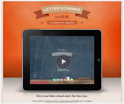
The ribbon nicely frames the name Letter Learner here. Also, the page is laid out as a single column; the ribboned title encourages the user to start their journey at the top and flow down from there.
Ribot
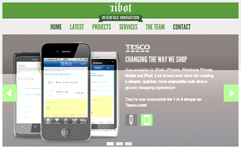
Ribot’s ribbon is fairly subtle. The flourish livens up the page, while summing up the company’s focus in a two-word tagline. A perfect way to set expectations, because the company name does not tell us what it does.
Alex Pierce
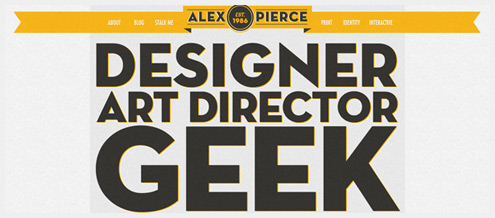
With the text being so enormous on the home page of Alex Pierce’s portfolio, it would take a rather bold element to balance it out. In this case, the ribbon does a good job of setting off the header. I also love how the folded layer in the middle of the ribbon adds focus to the designer’s name.
Rockaholic!
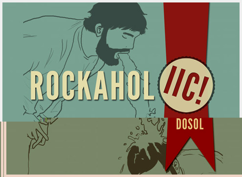
On the rather unusual Rockaholic!, the ribbon directs the user’s attention down, playing nicely into the vertical scroll of the website and helping the user dig into the content.
Paris Jones
The delicious red of the ribbon makes the band name Paris Jones pop out here. Even though the text treatment is rather subtle, the bold pattern ensures that you notice it.
Blog en Bois
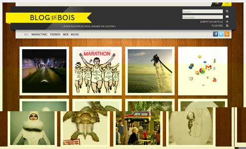
On Blog en Bois, the arrow effect of the ribbon is especially powerful, largely due to the contrasting dark behind the yellow. I find myself drawn back to the logo over and over again. It’s certainly a powerful way to engrain the brand in the user’s mind.
HTML5 Boilerplate
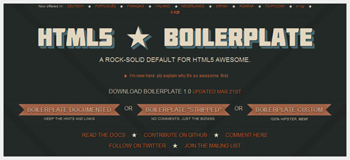
The popular website HTML5 Boilerplate uses ribbons to draw our attention to the most important action items on the page. I love that the ribbons do their job without having to say “Download here.” The combination of ribbons and labels tells us this is where to download the resources.
Cantilever Fish & Chips
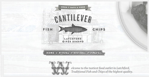
The purpose of the ribbon is not so clear on Cantilever Fish & Chips. The detail about being “Open 7 days a week” would seem relatively minor, but presumably it’s an important distinction for this restaurant.
Wells Riley
Wells Riley is a perfect example of ribbons in service of aesthetics. The ribbons look great here and become the focus of the page.
Dhiraj Singh Karki
I always love designs that depart from convention. The portfolio of UI designer Dhiraj Singh Karki is just such a website. Here, the ribbon is used rather cleverly and does not pack nearly the same visual punch as on other websites. It blends right into the page and yet has enough style to keep the design from looking too simple.
Chipmunk
Chipmunk is a great example of how well a ribbon can work with organic elements. The ribbon around the primary navigation fits in perfectly with the rich illustrations below. It also keeps the navigation from getting lost among the powerful artwork.
Ryan M. Stryker
Once again we see the power of the ribbon to focus attention. Its central location and bold contrast ensure that you don’t miss Ryan M. Stryker’s name.
Tags
Ennea
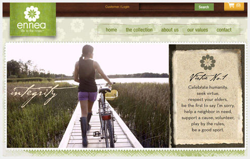
Given that Ennea is a clothing brand, it’s no surprise that the tag here contains the logo and brand name. Sometimes a straightforward approach works best.
Philip Meissner Design
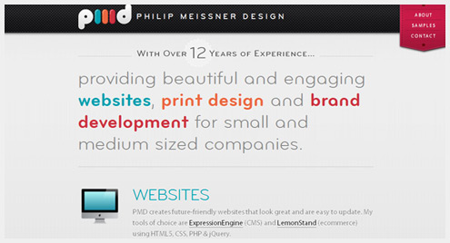
The tag contains the main navigation on Philip Meissner Design. Usually I would be put off by this unusual configuration of links, but the arrangement and colors here ensure that the links are super-easy to find.
Tinkering Monkey
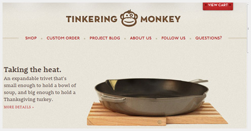
What could be more important on an e-commerce website then guiding users to check out?Tinkering Monkey has a nice little bold tag to help users complete their purchase.
Parkbud
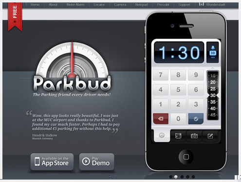
With all of the smartphone applications out there, the good ones need to communicate their key differentiators. Parkbud is free, and the bold red tag makes sure you know it. The tag is nicely tucked out of the way but always visible from the corner of your eye, reminding you that this tasty app is free.
Lense
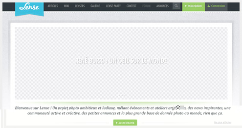
Lense is a perfect example of tags combined with fabric textures. Notice first the textured denim background; also, the scalloped border under the main navigation feels very much textile-oriented.
Coreymade
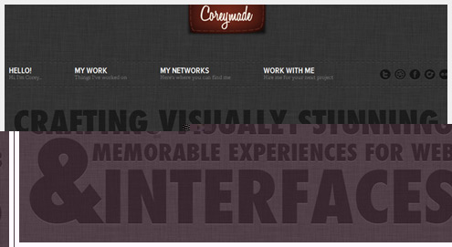
While a small detail, I really love the way the script font makes the tag on Coreymadefeel more like a tag on a shirt than a normal website logo. And the pseudo-3D effect makes the tag really pop for the viewer.
Netastica
The tag on Netastica is mainly there to look pretty, although it still does contain important information and links visitors to the home page.
Ryan Havoc Taylor
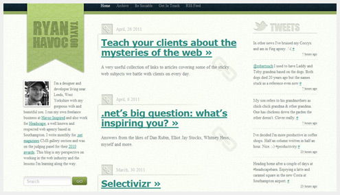
The tag is in such a visible location on Ryan Havoc Taylor’s website that it does not need a lot of contrast to stand out. It works well with the flow of the website and performs its role effortlessly.
Ribbons and tags
In the final part of this showcase, we’ll look at websites that make use of both ribbons and tags.
ClearSpan Media
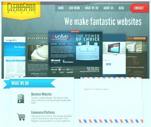
Ribbons and tags go very nicely together, as shown by ClearSpan Media. Here you’ll also find fabrics with patterns, stitches and subtle color variations. The two tags up top and the ribbon down below function as a kind of circle of interest for the user.
Krichevtsova Alexandra
While Krichevtsova Alexandra’s website is rather barebones in content, the tag and ribbon add extra life to key elements. You could enjoy this website without even knowing what the person does.
Wes Bos
本文由 Jackchen Design 1984 作者:jackchen 发表,转载请注明来源!
