网页设计
运用摄影元素的网站设计
摄影被许多设计师所钟爱。即使不是专业的也是业余里最专业的。很多设计师也运用这样的元素来勾画网页的整体设计。其实我们看到很多的奢侈品和大的品牌网站都运用了大幅的摄影图片配合简单的设计,让整个页面简单而富有气质。下面是我们收集的一些具有这类设计风格的网站,你可以从中获得好的设计灵感。
1. NL Engenharia
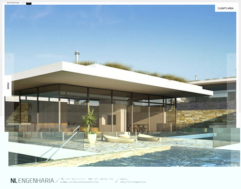
Architectural firms typically focus on photography on their websites. On NL Engenharia, though, the photography pretty much takes over the entire website. And for good reason; it quickly communicates the style, quality and scale of the firm’s work. You immediately see the type of work this firm does. This weeds out visitors who wouldn’t immediately be interested in its style. Many less confident shops would not be willing to define themselves so narrowly, for fear of losing work.
When to use this approach
This approach is great because it focuses the business. This type of work will not interest everyone. In a way, the photography functions to pre-qualify visitors. It becomes a critical component in the sales funnel. The firm knows that anyone who makes contact will know exactly what it offers.
2. Afgn
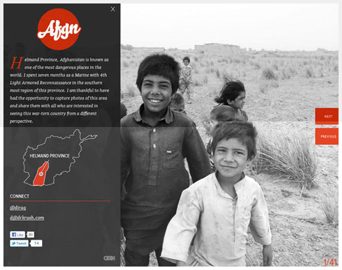
The sole purpose of Afgn is to share the creator’s photographs with the world. The fantastically simple interface puts the photography at center stage. No need for an elaborate framework to display the photos; the overlay on the left gives all the context you need to understand them. And we are free to hide the overlay and view the full photos. I particularly love that this gallery eliminates the need for thumbnails; you start with a full-sized photo.
Lesson to learn
Sometimes, bringing the content right to the fore makes the best sense. This website shows how content can replace the need for a framework at all.
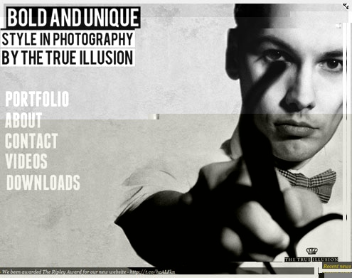
3. True Illusion
True Illusion is a studio that offers photography work, so naturally the content goes deeper in layers than the websites above. But I really love how the company still allows the photography to stand out; putting the work front and center like this is powerful. Don’t make people dig to find your work. Sell them on what you do from the moment they land on the website.
Cut to the chase
One of the most painful things is how many agencies make you dig for their portfolio. If your work is this delicious, make it easy for visitors to fall in love with it. You can sell the actual products later. This goes back to our idea of pre-qualifying visitors.
4. Driven
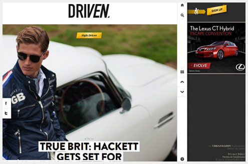
Driven is rather hard to pin down. Is it a blog? A magazine? A photo gallery? One thing it is not is normal. In showing off incredible cars through beautiful photography, this website breaks from your standard layout. Yes, there is text to go along with the visuals. But the photography of these incredible cars really drives the content (pun intended). The cars are so gorgeous, in fact, that you don’t need any special kind of photography to show them off.
Break the rules
Sometimes you can get away with disregarding the conventions of the web. It’s not easy and it won’t always work, but websites like this prove that risks can pay off. It also shows how eye-grabbing objects go a long way to smoothing over usability problems.
5. Clyde Quay Wharf
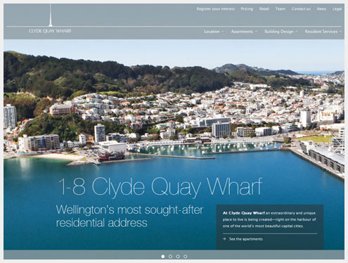
It should come as no surprise that photography plays a powerful role in selling real estate. On Clyde Quay Wharf, photography dominates the design. And why not? One look at the location and you can’t help but want to live there. Given that these apartments start at $1.3 million, the website has to do whatever it can to justify the price tag. Showing the unique location is a great approach in this case, at least to someone as unsavvy about real estate as me. After all, you can find beautiful apartments anywhere. Finding a location like this is much harder, and it gives the properties a distinctive air.
Focus on the unique
This design focuses on the unique selling point of this property: location. Find the most distinct selling point of your product, and hammer the message home. Without it, this would be yet another website selling yet another fancy apartment.
6. Grand Things
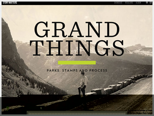
Photography instantly communicates information. Grand Things immediately sets a mood, using black and white photography to tell a story. It takes a bit of wording to set the stage, but the big dramatic photograph works flawlessly with the content, preparing the visitor for the subject.
Words help
As much as photography communicates, don’t leave too much to the imagination. Without the words, people would be rather helpless to understand the purpose of this website. Only a few words are needed, but they set the context for the photograph.
7. Moccabar
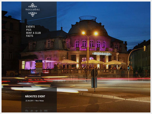
Photography can also be used to communicate ideas and information that can’t quite be captured in words. Consider Moccabar, a high-end bar. No amount of fancy marketing copy could ever communicate the particular style of this bar. In fact, on seeing the photos, even referring to this as a bar would be a stretch. The photographs immerse you in the location first and foremost. Inset photographs surrounded by text would not do the place justice.
What makes you special?
Some products and clients break the mold. Convincing people of as much can be hard, though. Photography can be the proof that shows that the client is more than a stereotype.
8. Peter McLeavey Gallery
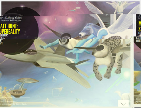
Many galleries focus on their central location, their beautiful building or some other detail that they deem important. The Peter McLeavey Gallery puts the artwork front and center. Most customers don’t come to you because of the environment, as cool as it might be. By focusing entirely on the artwork, this website feels totally unique and memorable.
Lose your ego
Put yourself in the user’s shoes, and consider why they might be visiting the website. Prominent photography like this can support that purpose. Don’t focus on yourself or what you love about the company. Focus on what users want.
9. Awolnation
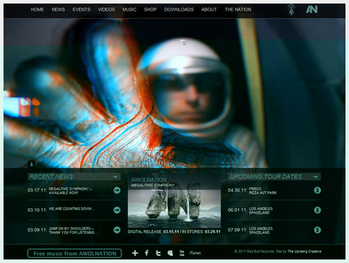
On the website for the band Awolnation, photography serves a singular purpose: to set a mood. The website focuses not so much on the band, as many other band websites do. Rather, it establishes a kitschy retro theme that adds to the band’s unique personality. The photography supports this, setting the mood with its sci-fi, retro-art aesthetic. Listen to some of the music and watch the video to see why the photography plays directly into the style of the band.
Set a mood
Photography doesn’t always have to be literal. It can merely set a mood. Getting the balance right can be difficult, but sometimes a pretty picture is just a pretty picture.
10. Cufflink Suite
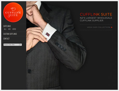
Some products are just more exciting than others. And for the less-exciting ones, creative photography can make them seem more so. A website about cuff links might not seem to have much going for it. But when you land on Cufflink Suite, you get the feeling that you’re experiencing something exceptional. It is remarkable how the photograph completely changes your perception.
Go big
This photograph would not have nearly the same impact if it was small, in a nice little frame on a standard e-commerce page. Size and scale magically give a subject greater impact. I remember this from design school: when in doubt, make it bigger! (Except the logo.)
11. Handi Hikes
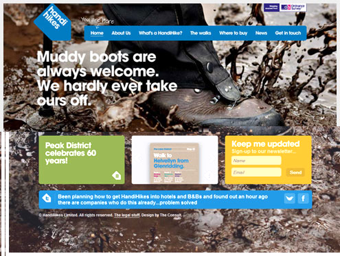
Handi Hikes uses big photographs to give context to its products. The market for travel guides is heavily saturated, but this company offers a personal touch by producing highly focused, highly functional hiking guides. The photographs in the background ensure that you understand what type of guides are for sale.
Provide context
The photographs here explain the context in which you would use these products. Consider how or where your product will be used. Photographs can serve as extensions of the product, communicating its purpose and benefits.
本文由 Jackchen Design 1984 作者:jackchen 发表,转载请注明来源!

jackchen
文章:1658

不是很懂啊,大概意思是不是说,在网站建设时加入了图片呢?